Mercury Original Component Library | People Inc.
A detailed design system of turnkey components in a CMS.
Overview
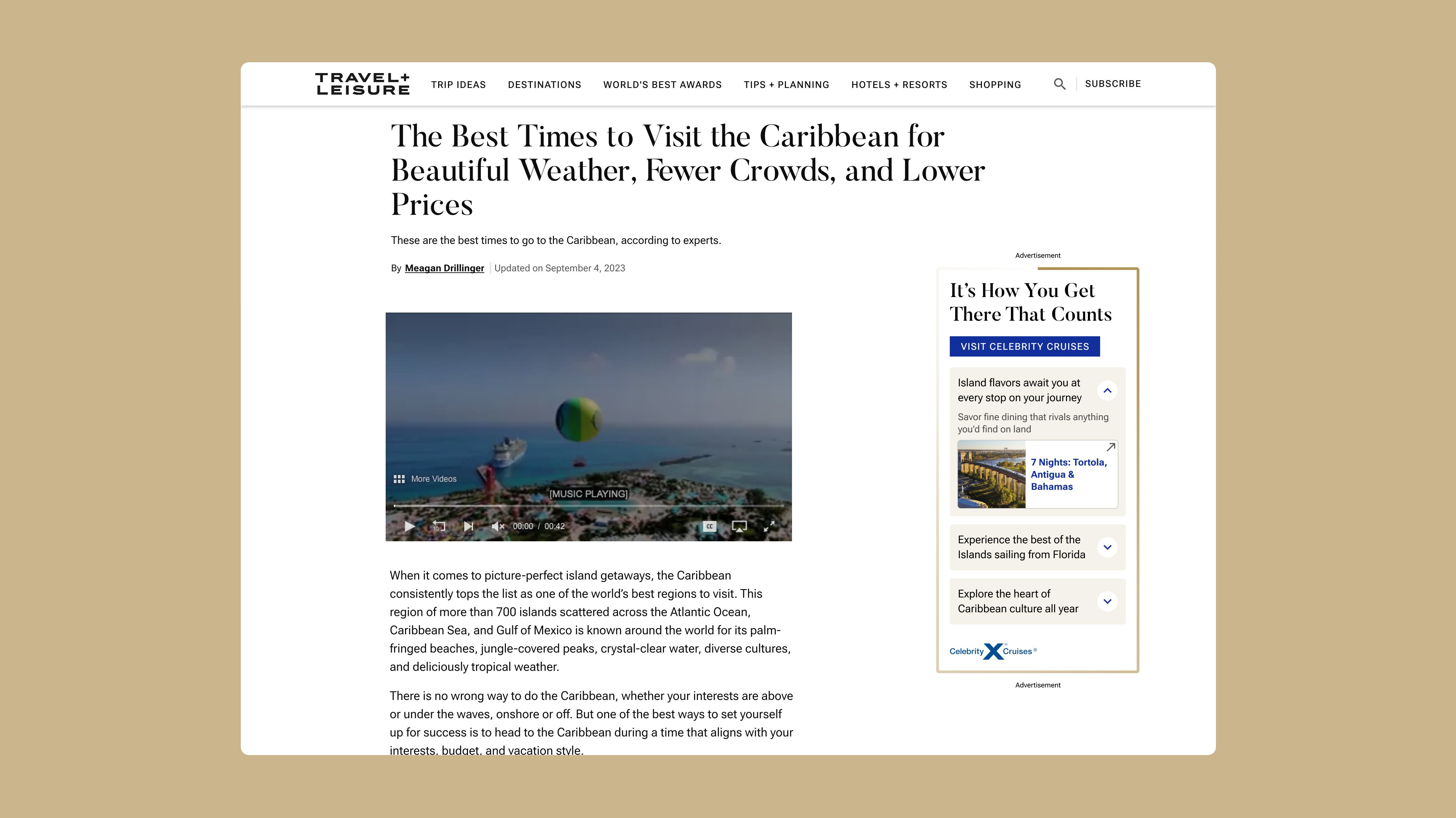
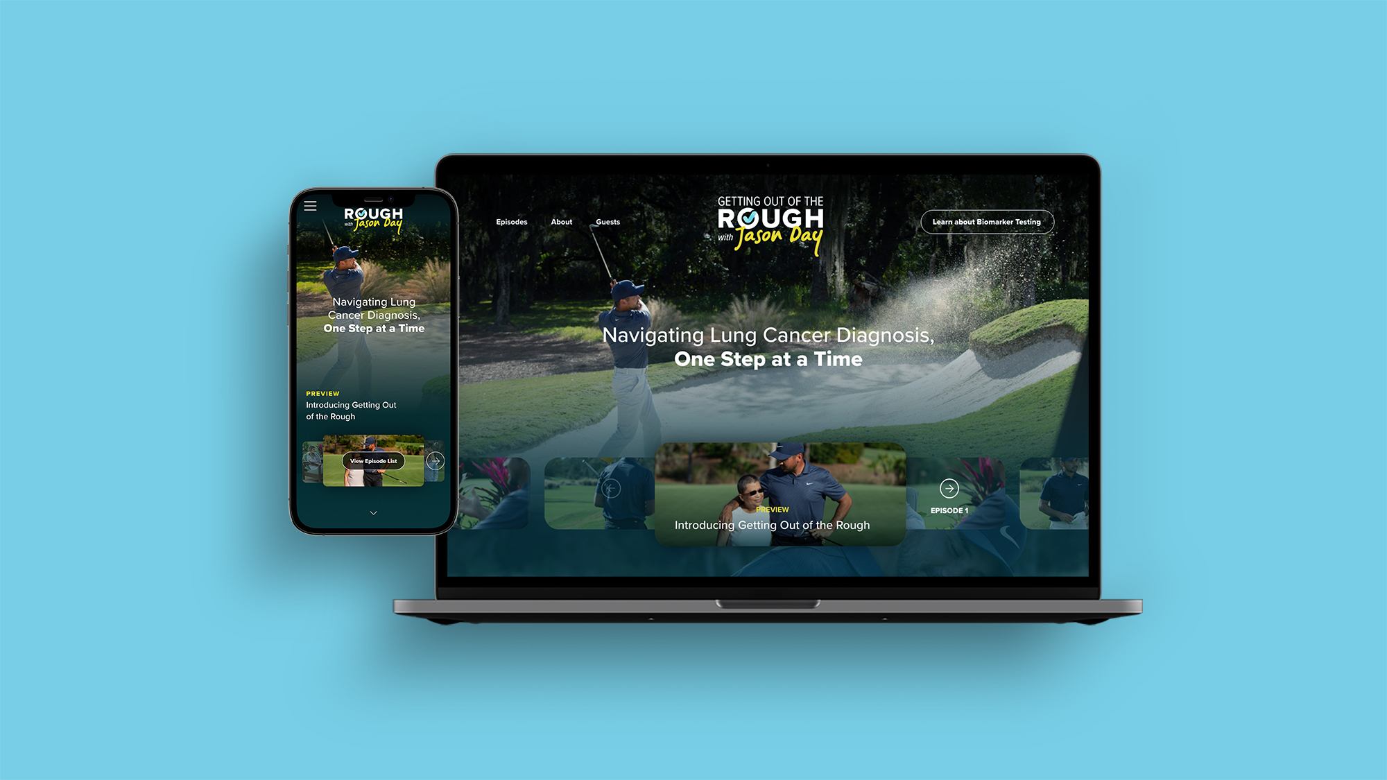
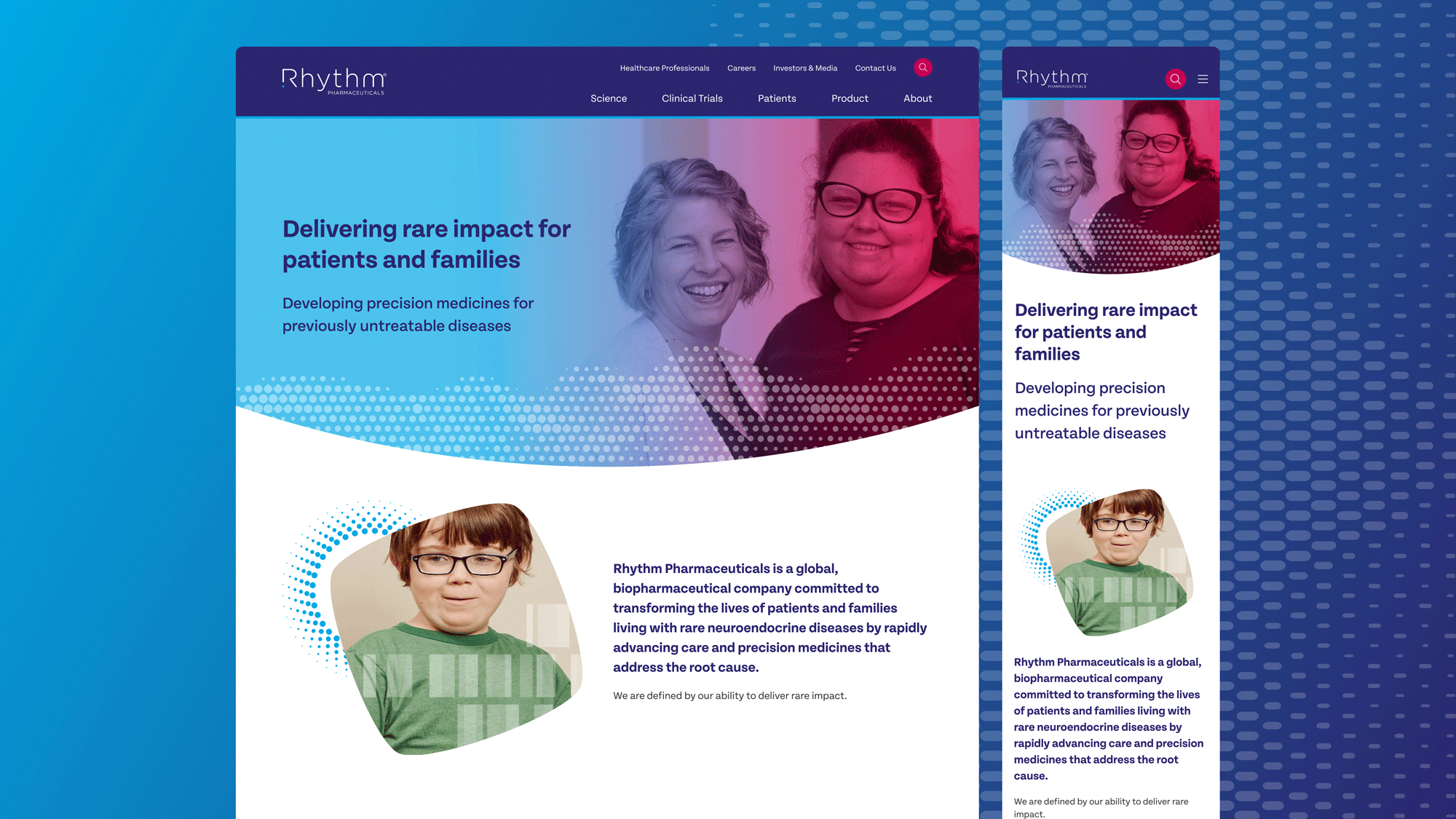
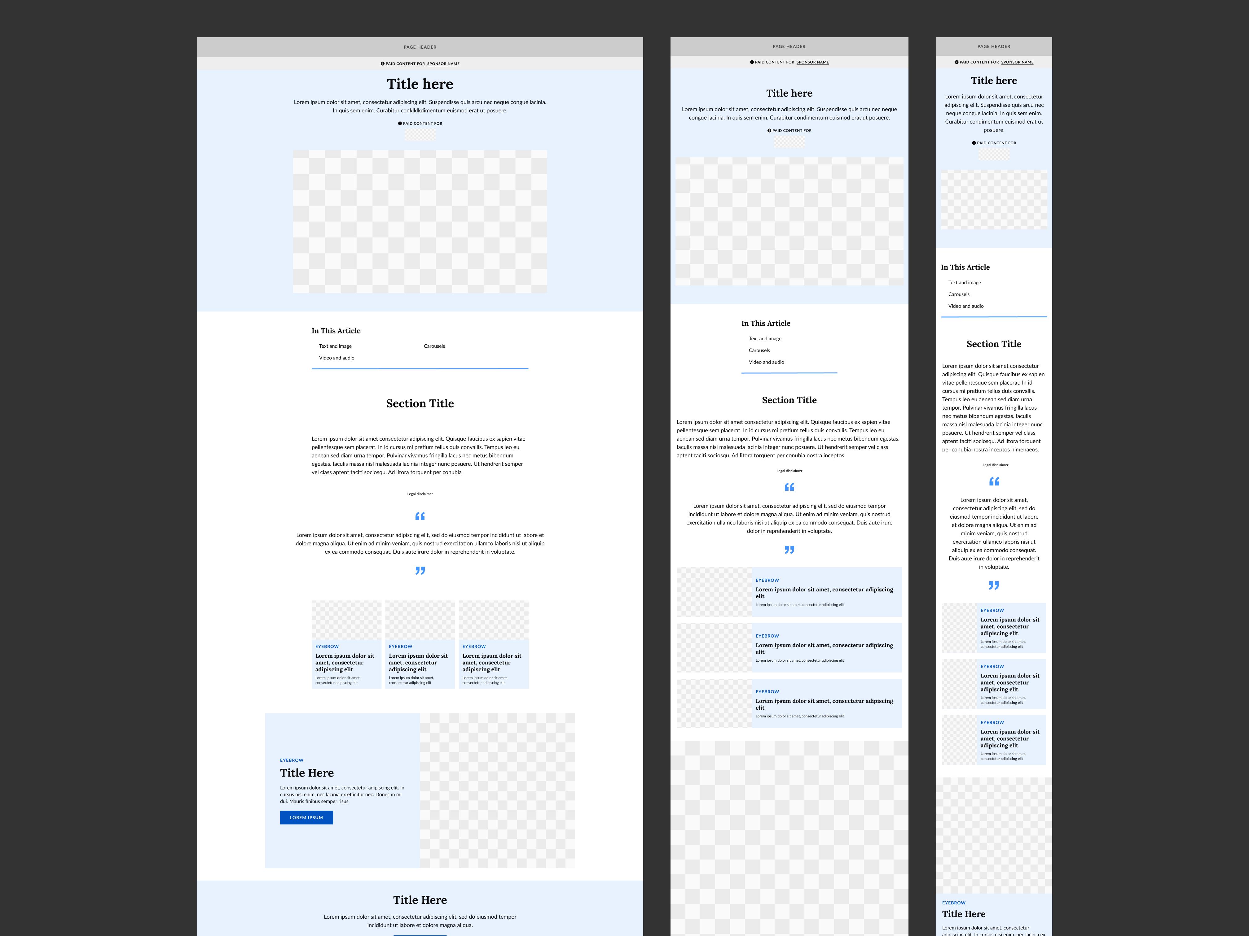
At People Inc. we have a native advertising product, Mercury Original, that contains a set of turnkey components styled to our large portfolio of brands. In my role, I maintain and improve this design system in Figma. It serves as a mock tool for visual designers to build premium advertising pages, as well as documentation for communicating desired functionality with developers.
Working with a multi-brand design system
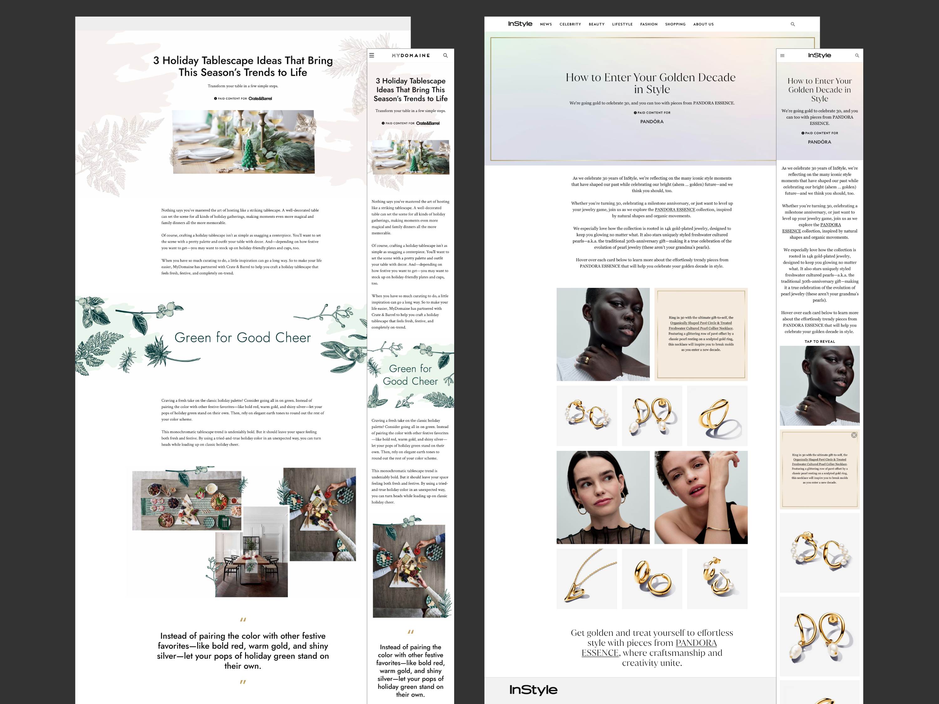
We want to ensure a consistent experience of our brands, across native advertising templates like Mercury Original and the editorial templates which are built separately. So, I rebuilt the Mercury component library to inherit design tokens from the editorial side. This variable library houses the fonts, colors, spacing, etc for all 30+ People Inc. brands. I mapped those pre-established variables to our unique set of Mercury components.
This helps on many fronts. It honors the design decisions made by the editorial brand designers and creates consistent brand experiences. Additionally, this streamlined the workflow of designers who make mocks in Figma. They simply need to choose their brand from a dropdown to immediately re-skin a full page of Mercury components to their brand.
Workflow for creating page design mocks
I took this opportunity of restructuring the component library to also make improvements for designers’ workflow. These designers use the Figma components to build mocks and prototypes of custom pages.
Challenge #1: Designers often detached instances because of limited flexibility of the Figma components.
Solution #1: Used component properties to create a comprehensive list of controls that designers can use to customize a component.
Challenge #2: Mobile versions of the components were not previously available due to the high volume amount of work it would require to maintain desktop and mobile versions of each component across all 30+ brands. Consequently, designers often did not provide mobile versions of images when needed, causing delays for the team responsible for building pages in the CMS.
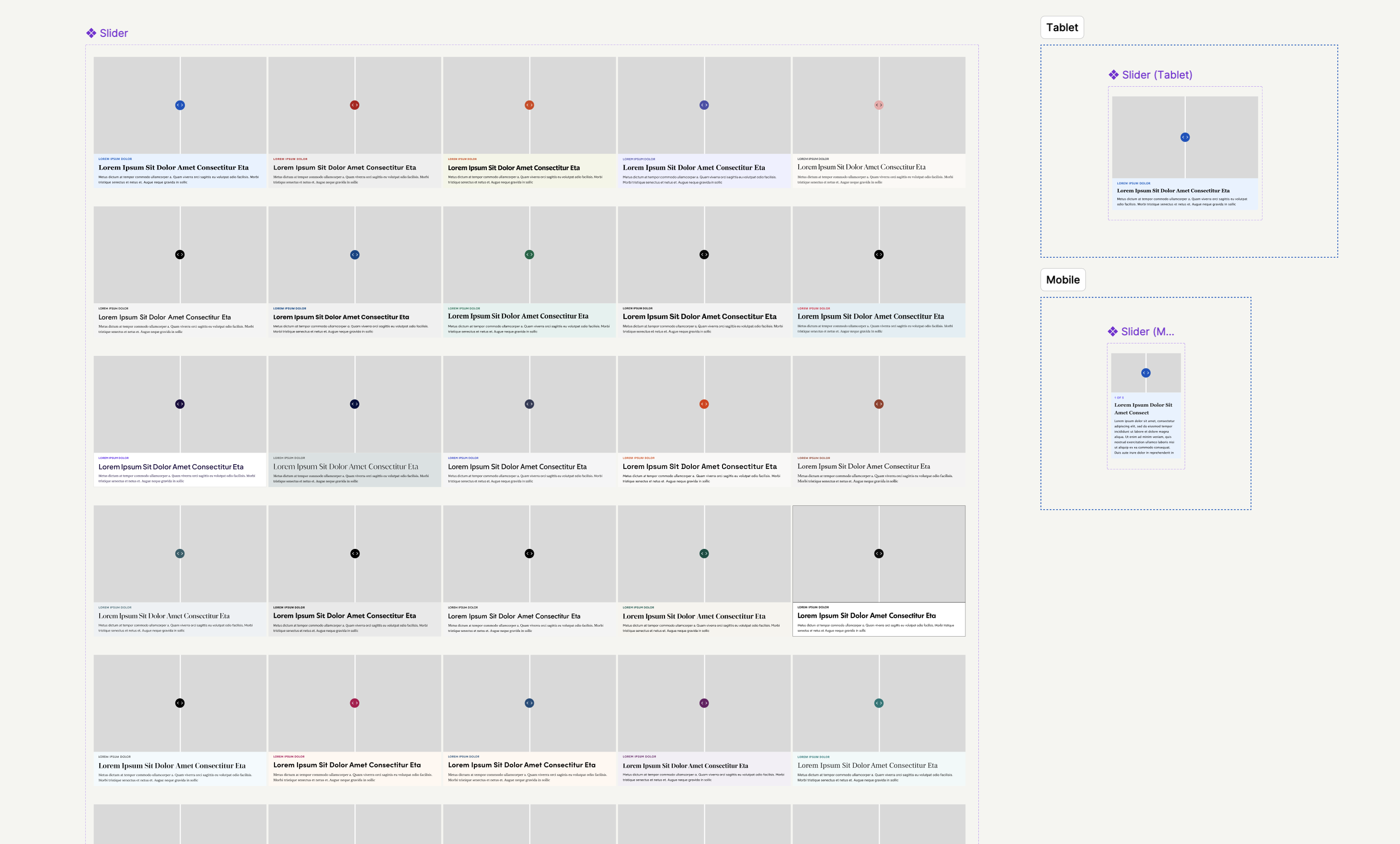
Solution #2: The use of variables made the components much leaner. Where previously each component had a variant for all 30+ brands, now a single variant can support all those brands. Now, each component can be mocked for desktop, tablet, and mobile and this was done in a time-efficient manner.
Documentation
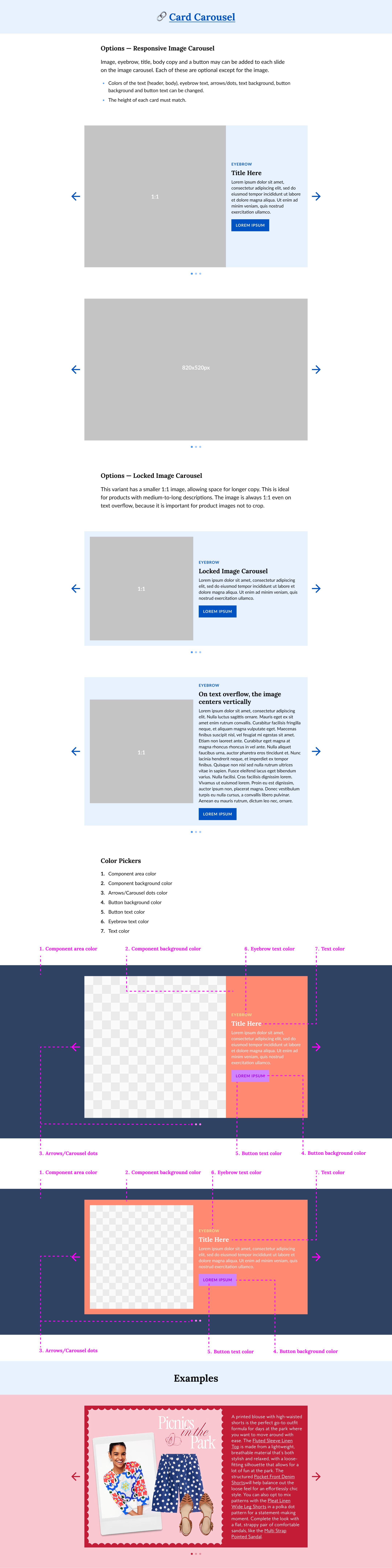
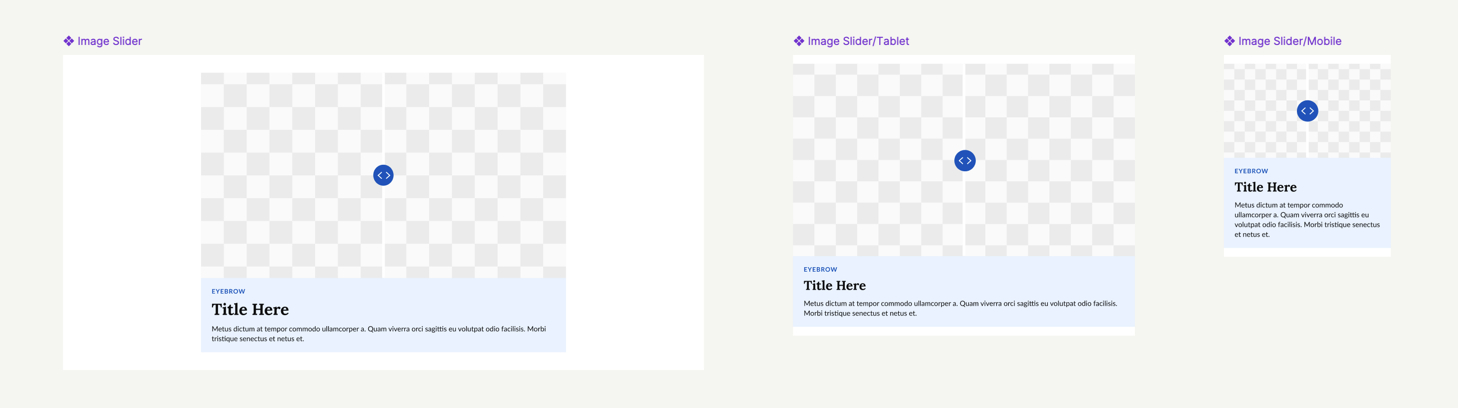
Lastly, I created detailed documentation of each component for visual designers to reference. This includes specs, functionality, and creative examples for inspiration.